LearningClues (opens in a new tab)
Making an AI chat usable for every student, on any screen
- Role
- Frontend Engineer
- Timeline
- June 2026
- Team
- Product Designer
- Frontend Engineer (me!)
- Tools
- Skills
- Frontend Engineering
- Accessibility
- Responsiveness
- Design Systems
- Agentic Coding
- AI Chat
Overview
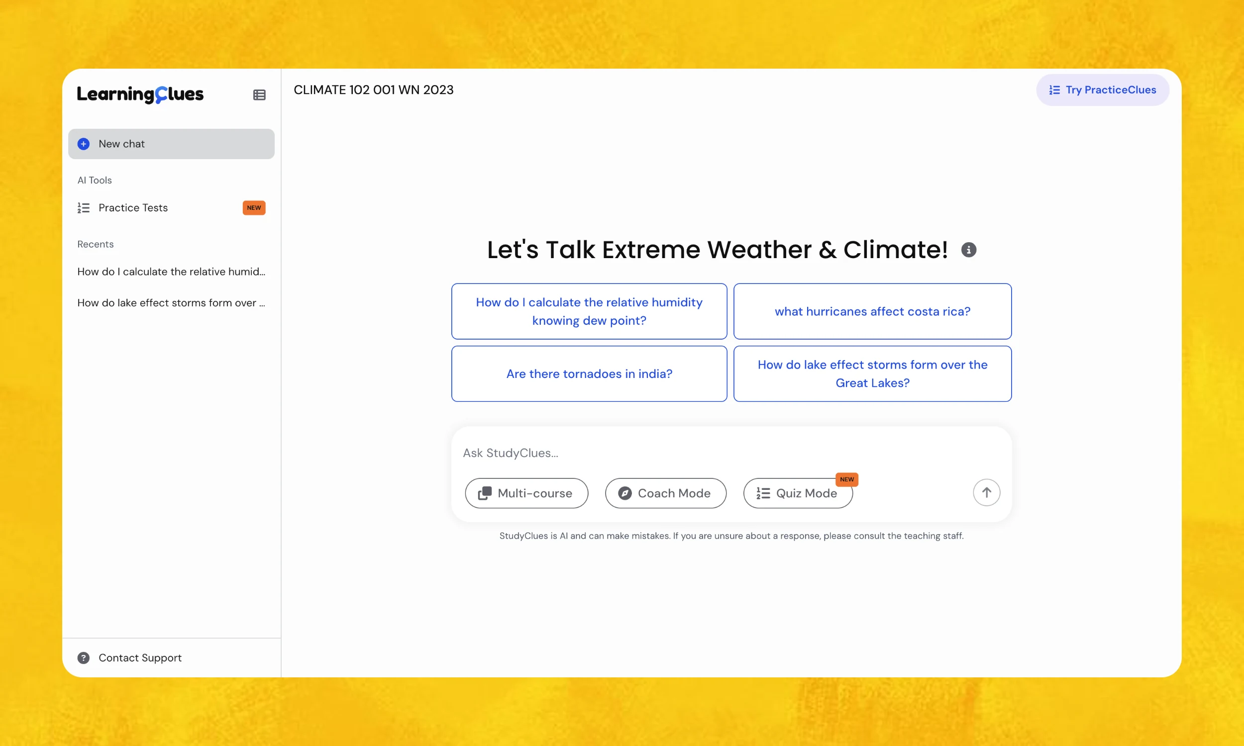
StudyClues is LearningClues' student-facing AI chat for higher education. Unlike general-purpose tools (e.g., Claude, ChatGPT), its answers are grounded in a student's own course materials, with citations back to the exact lecture moment or document section they came from.






Ask StudyClues…
The procurement process for higher-ed is often long-winded and ambiguous
Ahead of the Fall 2026 semester, two R1 universities sent us lists of accessibility blockers. Conformance was the primary barrier to adoption so the objective seemed clear:
“clear the accessibility blockers”
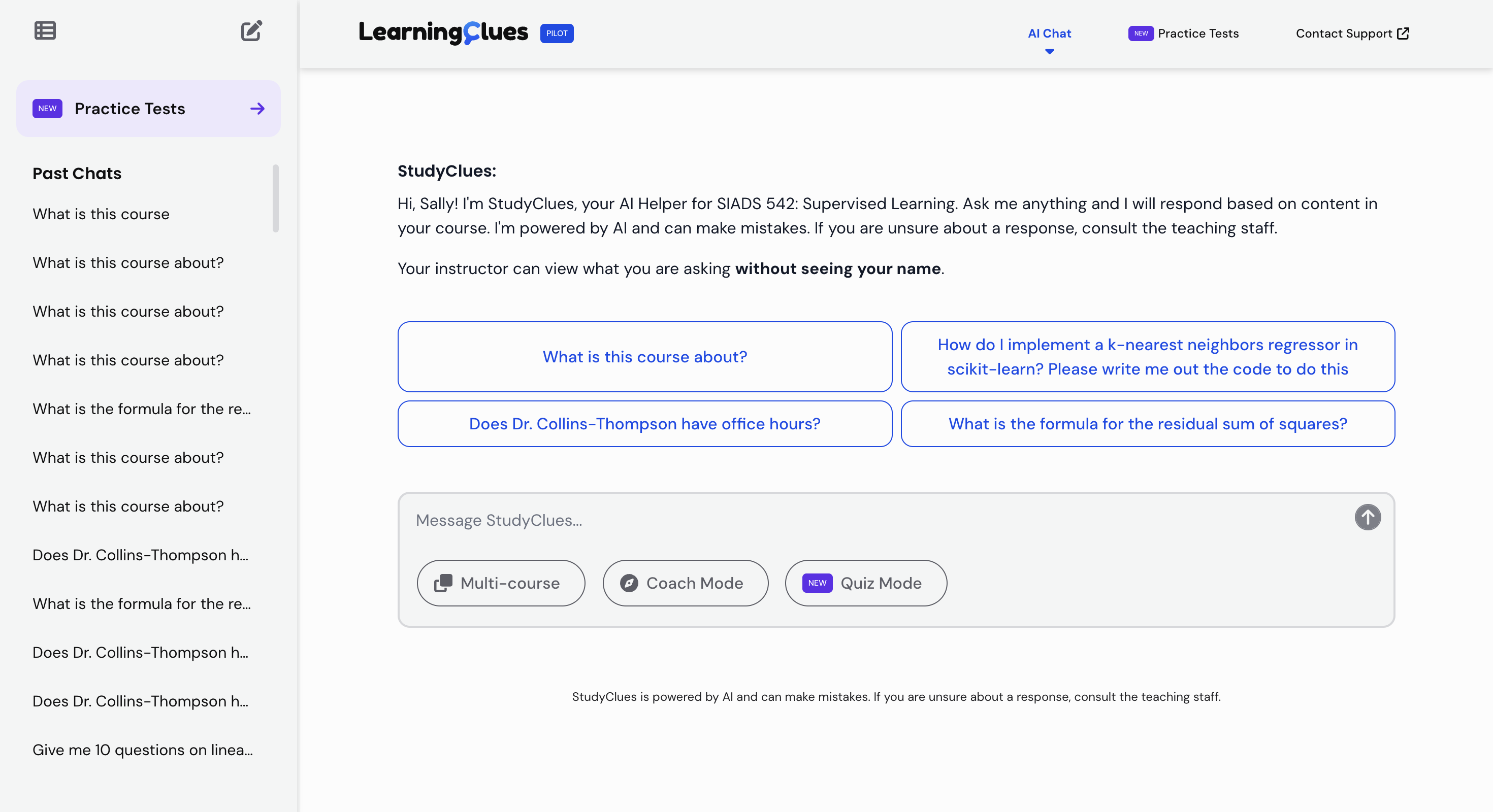
My audit changed the scope. The blockers were not isolated defects. They traced back to an interface built for a single 1440px laptop screen, which was also the reason tablet and mobile users could not use the product at all. Clearing the accessibility failures and making the interface responsive turned out to be the same work. And because the layout was being rebuilt from the ground up, a UI refresh that had been overdue for more than a year came with it.
Impact
Procurement unblocked at 2 R1 universities where conformance had stalled adoption
Layout shift reduced to 0.00 CLS when switching conversations
Usable at 400% zoom with no loss of content or functionality
Now works across 5 breakpoints from phones to ultra-wide
Resolved 6/6 accessibility issues found in the audit, 2 of them blocking core flows entirely
Problem
Accessibility conformance is a business problem, not a “polish” problem
The DOJ's ADA Title II rule sets WCAG 2.1 Level AA as the standard for public universities, with an April 2027 compliance deadline. Institutions evaluating StudyClues were not just treating accessibility as a “nice-to-have". This is why two R1 universities sent us lists of blockers solely related to accessibility.
Higher education institutions treat accessibility conformance as a requirement rather than a preference, and those lists were the reason this project existed.
The blockers shared a root cause
I ran an accessibility audit of the existing system because a list assembled from outside the product is unlikely to be complete and found six issues, two of which made core flows unusable outright rather than merely difficult.
At 200% zoom on a 1280px viewport, starting a new chat clipped content behind a hidden overflow, leaving the flow unusable. That is a direct failure of WCAG 2.1 SC 1.4.4 Resize Text (AA). At 400% zoom, any response containing a code block introduced two-dimensional scrolling, failing SC 1.4.10 Reflow (AA).
Neither was a local bug. Content was being hidden and forced into two-dimensional scrolling because the page structure assumed one viewport width, the 1440px laptop screen the interface had originally been built for. The same assumption was why tablet and mobile users could not use StudyClues either!
The app had a broken structure for screen readers
Beyond the blockers, the structure underneath the interface was inconsistent. Three issues shared a root cause: the document's programmatic structure did not describe the page a user was actually on. All three touch SC 1.3.1 Info and Relationships (A):
- The sidebar's conversation history was marked up as a hierarchy of headings rather than a list.
- Markdown rendered in chat responses skipped heading levels, because the LLM generating the answers had no knowledge of the surrounding page structure.
- Components sat outside any landmark region, and there was no way to skip past navigation to the chat itself.
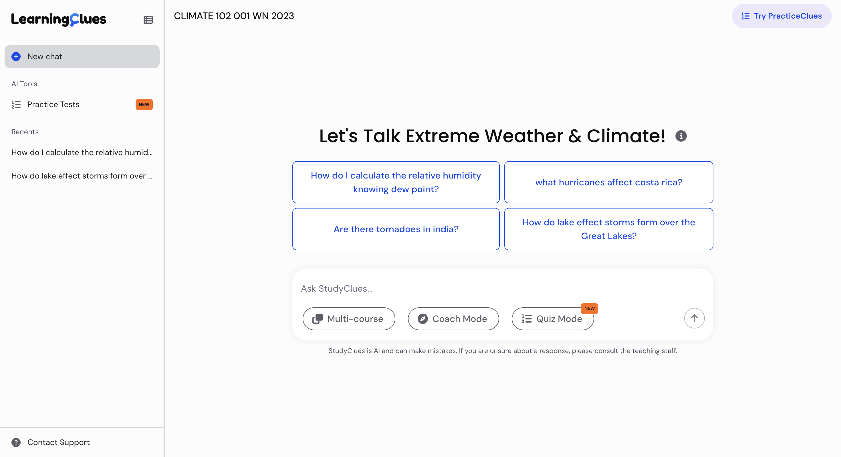
A visual refresh that had been deferred for over a year now became feasible
The accessibility blockers and the responsiveness failure were the same defect observed from two directions, which meant they could not be fixed separately. This is also what expanded the project. Rebuilding the layout to satisfy reflow meant rebuilding it for every screen size, and rebuilding it for every screen size meant the interface was being reconstructed anyway.
As such, a visual refresh that had been deferred for over a year now became feasible inside the same four weeks rather than a separate initiative.
Defining "Done"
One sentence framed the work:
“the interface should not be the reason a student does not return”
Once the audit established that the blockers and the responsiveness failure were the same problem, the scope resolved into three commitments that had to be delivered concurrently:
Clear every accessibility blocker.
We worked from two lists: the blockers reported by the two schools, and the fuller set from my audit.
“Done” meant no remaining barrier to completing a core flow by keyboard or screen reader.
Make the product work at every size students actually use.
Not a tablet breakpoint bolted onto a desktop layout, but a mobile-first rebuild covering everything from mobile to ultra-wide, and holding up under zoom to 400%.
Refresh the UI to match the product students expect.
Students using StudyClues are already fluent in Claude, ChatGPT, and Gemini. The UI needed to feel current against those, so that visuals never became a reason to doubt the answers' quality.
Rebuilding for Every Screen
The old interface was built for a 1440px laptop screen, and that assumption was what produced the accessibility blockers as much as the missing mobile support. Rebuilding it meant deciding, per component, what should change and at which point.
Mobile-first, with breakpoints we could justify
I built up from the smallest viewport rather than down from the 1440px layout. That ordering matters: starting at mobile forces you to decide what is essential before you have room for anything else.
We started from Material Design's guidelines, then adjusted against usage data on the viewport sizes students were actually using and against what competing AI interfaces supported. That gave us five breakpoints:
Mobile default
Tablet 768px
Compact 1024px
Desktop 1440px
Max 1600px
The sidebar changes layout, not just size
The sidebar was the component that needed an alternate layout the most. Until the compact breakpoint (1024px), it's a drawer: hidden by default, and sliding out over a dimmed backdrop when opened.
Above the compact breakpoint (1024px), it stays in place with collapsed and expanded states so the user can reclaim screen real estate when they do not need the conversation history. The user's choice is persisted to localStorage, so the layout a returning student sees is the one they left, with the sidebar animating smoothly into its stored state on load.
Alternate layouts for content that risked overflow
Some elements could not simply reflow and instead required alternate layouts:
Suggested queries. The queries sit in a single row on mobile and switch to a 2x2 grid above the tablet breakpoint (768px) to preserve readability and eliminate scroll.
Header. Usage data showed students navigating between products from the sidebar far more than from the header. Simplifying it down to a salient button for the quiz platform removed the overflow risk at high zoom.
Supporting zoom is inherently a responsiveness problem
Supporting 400% zoom on a 1280px viewport is equivalent to laying out for a 320px-wide screen, which is why the mobile-first work and the reflow fix were the same work rather than distinct efforts!
Remediating Accessibility Blockers
Accessibility was the foundation for this project, not an afterthought. I ran the audit that defined the scope, made the implementation decisions, and verified the result by hand.
Fixing the 2 critical blockers
- At 200% zoom on a 1280px viewport, starting a new chat clipped content behind a hidden overflow. This failed SC 1.4.4 Resize Text (AA), which requires text to scale to 200% without loss of content or functionality. The fix was the layout restructure described in Rebuilding for Every Screen: the sidebar became a drawer, the suggested queries reflowed, and the header shed weight.
- At 400% zoom, responses containing code blocks forced two-dimensional scrolling, failing SC 1.4.10 Reflow (AA). Long unbroken strings do not respond to container-level layout work, so this took targeted CSS overrides on the markdown renderer for word breaking and overflow.
Structure the screen reader could finally rely on
- I rebuilt the sidebar's conversation history as a nested unordered list. This is a common mistake, and it matters because a screen reader user navigating by heading is trying to move through content, not through navigation!
- Rather than trying to constrain the LLM's (often indeterministic) output, I used component overrides on react-markdown to remap heading levels dynamically so they fit the page's outline.
- I placed every component within an appropriate landmark and wrapped the chat area, message field and messages together, in a main element, then added a "Skip to Main Content" link so keyboard users could bypass navigation entirely.
A drawer that traps keyboard users is worse than no drawer
A drawer that traps keyboard users is worse than no drawer. I wrapped the sidebar in focus-trap-react, a lightweight and well-established library, rather than hand-rolling focus containment. That was a deliberate choice about where to spend effort!
The drawer dismisses on Escape, on selecting a navigation item, and on clicking outside, which keeps SC 2.1.2 No Keyboard Trap (A) satisfied. On close, focus returns to the element that opened it, so a keyboard user is not dropped back at the top of the document.
One fix that was not a “conformance issue”
There was a layout shift on conversation switching that failed no success criterion. I fixed it anyway :)
A user relying on screen magnification sees a fraction of the viewport at a time, and a message field that travels to the center of the screen and back has, from their perspective, disappeared and reappeared somewhere else. Users with cognitive or attention-related disabilities face the same disruption for different reasons. The skeleton screen holds the layout in place and, through its shimmering animation, communicates that something is loading rather than leaving the movement unexplained.
Results
The rebuild shipped to production at the end of the four weeks, and conversations with two R1 universities that had stalled on conformance were able to move forward.
Every core flow is operable by keyboard and screen reader
All six issues from the audit are closed, including the two that had made flows unusable by keyboard and screen reader outright. I ran every core flow with VoiceOver and by keyboard, then ran automated tooling across the rebuilt interface: WAVE, aXe DevTools, and HeadingsMap for document structure.
The interface now works from mobile to ultra-wide
A product that had been built for a 1440px laptop screen now supports five breakpoints from mobile to ultra-wide, and holds up under zoom to 400% on a 1280px viewport, the equivalent of laying out for a 320px-wide screen. Students on tablets and phones can use the platform, which was not previously true at any zoom level.
Layout shift on conversation switching is gone
Switching conversations now measures 0.00 CLS in the Chrome DevTools Performance panel. The message field stays where it is while history loads, and a shimmering skeleton screen communicates a loading state rather than leaving the movement unexplained.
Several components are standardized
Several components built here were general enough to belong to more than one product. The sidebar, skip link, modal, accordion, and badge were extracted into the LearningClues design system's component library, built against the same DTCG design tokens the rest of our products consume. As a bonus, the accessibility work in them is inherited rather than rebuilt each time!